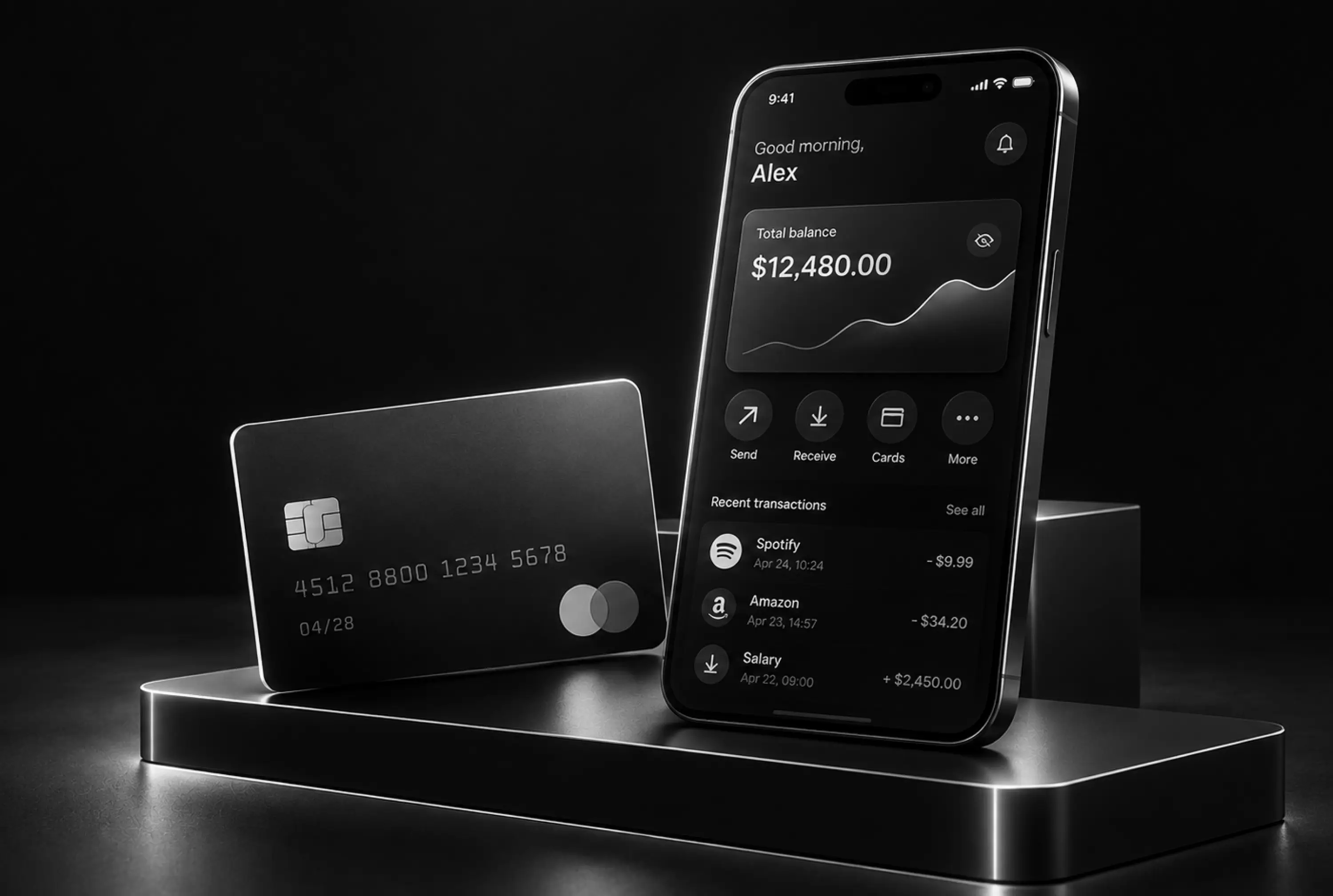
Digital banking UX design comes down to one test: can someone move, check or protect their money without hesitating? When the answer is no, they open a support chat or call the branch. Some just quietly switch banks. The visual layer matters less than most teams expect. What decides the outcome is the dozen or so flows people repeat every week, and whether each one feels safe and obvious.
Below we break those flows down one by one, then cover security, accessibility and the numbers that show whether the UX works.
What Is Digital Banking UX Design?
Digital banking UX design is the practice of shaping how customers open accounts, authenticate, pay, track and manage money across a bank's mobile app, web banking, chat and other digital channels. It covers the logic of each task, the wording, the error handling and the moments of reassurance. It goes well beyond how the screens look.
UI is the visible part: colors, type, components, icons. UX is everything underneath. A banking app can have a beautiful card carousel and still fail at UX if a first-time user can't figure out how to dispute a charge. Banks tend to overspend on the first and underfund the second, because a new home screen looks better in a board deck than a fixed dispute flow.
Why Banking UX Is Harder Than Regular App UX
A food delivery app can afford a confusing settings page. A bank can't. Three things make the job different.
Trust is earned per screen
People bring real anxiety to a banking app. They check a balance before rent is due, or send a payment they can't take back. A screen that says "Processing" with no time estimate makes people tap the button again, and now support is dealing with a duplicate payment. Small ambiguities turn into tickets and chargebacks fast.
Regulation shapes the flow
Many decisions are made before a designer opens Figma. KYC (know your customer) rules decide how much identity data onboarding must collect. In the US, Regulation E sets requirements for electronic fund transfers, including error resolution and the disclosures people must see before sending an international remittance, as the CFPB's Regulation E text lays out. Accessibility expectations under the ADA push banks toward WCAG conformance.
Good banking UX doesn't fight these rules. It treats them as design inputs and finds the clearest way to meet them, for example by putting a required fee disclosure on the review screen in plain words instead of burying it in a linked PDF.
Legacy core systems limit the front end
Many banks still run on core platforms that are decades old. Transaction descriptions arrive as raw merchant strings, some balances update in overnight batches, and certain actions can't be done in the app because the back end doesn't expose them. A redesign that ignores this produces mockups engineering can't ship. Map what the core can and can't do early, then design around its weak spots: enrich merchant data through a third-party service, or label a "pending" state clearly instead of showing a balance that will change tomorrow.
Where Digital Banking UX Usually Breaks
The same problems show up in almost every banking product we audit. Onboarding asks for too much too early, sometimes requesting employment details before the user has even seen what the account offers. Authentication is either too strict (a one-time code for every single login) or too loose, with no extra check before a large transfer. Navigation follows the bank's org chart, with "Cards," "Accounts" and "Services" split by internal department rather than by what the user is trying to do.
Transaction lists are another constant. Seeing "POS DEBIT 4829 SQ *BLUEBTL" on a statement makes people think they've been defrauded when they actually bought a coffee. That one line of unreadable text generates a surprising share of dispute requests.
Designing the Core Banking Flows
Most of the value in digital banking UX design sits in a handful of flows. Get these right and the rest of the app matters far less.
Onboarding and identity verification
Account opening is where most banks lose people. The fix is sequencing. Ask for the minimum to start (name, email, phone), show progress clearly, and explain why each sensitive field is needed. "We need your SSN to verify your identity, as required by federal law" gets far fewer drop-offs than an unexplained field.
For ID checks, the standard pattern now is a document photo plus a selfie with a liveness check, handled by vendors like Persona, Onfido or Jumio. The camera UX matters: show a frame guide, detect glare, auto-capture in focus, and say exactly what went wrong when a photo fails. Let people save progress, since many don't have their ID at hand. We go deeper on this in our user onboarding design work, because it is usually the highest-leverage fix in a banking product.
Login and step-up authentication
Daily login should be nearly invisible: Face ID, fingerprint or a passkey, done in a second. Save the heavier checks for risky moments. This is step-up authentication. A user checking a balance on a known device gets in with biometrics, while the same user adding a new payee or sending $5,000 gets an extra confirmation. People accept friction when it clearly matches the risk. They resent it when it's applied to everything.
Sending money and confirming payments
A payment flow has three jobs: make the amount and recipient impossible to misread, show every fee before the user commits, and confirm the result without ambiguity. The review screen is the most important screen in the flow. Show the amount in large type, the recipient's name as the bank has it on record, and the arrival time.
Irreversible payments need extra care. Zelle, for example, shows a warning that people should only send money to people they know and trust, because those transfers generally can't be cancelled once sent. After confirmation, show a success state with a reference number and a shareable receipt, not just "Payment sent."
Transaction history people can actually read
This is where data enrichment pays off. Replace raw descriptors with clean merchant names, logos and categories. Monzo made this a signature feature years ago, showing merchant logos and even a map of where a card payment happened. Add search and filters by amount, date and merchant. Clearly separate pending and posted transactions, with a short note explaining that pending amounts can still change.
Card controls and self-service
Freezing a card should take two taps, not a phone call. The same goes for setting spending limits, blocking online or international transactions, reporting a lost card and ordering a replacement. Revolut popularized the instant freeze toggle and it has since become a baseline expectation. Every task completed in the app is one that doesn't reach the call center.
Error states and support handoff
Errors in banking need to answer three questions: what happened, is my money safe, and what do I do now. "Transaction failed. Error code 5021" answers none of them. "Your transfer didn't go through and no money left your account. Try again or contact us" answers all three. When the user does need help, hand them off with context. A support chat that already knows which transaction they were looking at saves both sides several minutes of back and forth.
Balancing Security and Usability
The old assumption that more security means worse UX doesn't hold anymore. Biometrics and passkeys are both more secure and faster than passwords. The real balance is about where friction sits.
A risk-based model works best. Low-risk actions on a trusted device flow freely. Higher-risk actions (new device, new payee, unusual amount, changing contact details) trigger extra checks. A short line like "We're asking because this is a new payee" explains the extra step and builds trust instead of irritation.
Personalization Without Creeping People Out
Banks hold more personal data than almost any other app on the phone, which makes personalization both powerful and delicate. Spending summaries by category, alerts when a subscription price goes up, or a heads-up that a bill will overdraw the account in three days are all helpful.
AI assistants push this further. Bank of America's Erica and Capital One's Eno answer balance questions, flag unusual charges and explain transactions in plain language. The challenge is scope: an assistant that tries everything and fails half the time hurts trust more than one that does five things reliably. Show what it can help with, and always offer a path to a human.
The line to avoid is anything that feels like the bank is judging or selling. A "You spent 40% more on restaurants this month" message reads as useful when the user turned on budgeting insights. Unprompted, it reads as surveillance. Let people choose which insights they see.
Accessibility and Omnichannel Consistency
Banking customers include older adults, people with low vision, people using screen readers and people managing money on a cracked phone screen. Designing to WCAG 2.2 at level AA is the practical baseline: sufficient color contrast, labeled controls, touch targets large enough to hit, support for dynamic text sizes and no information conveyed by color alone. A red negative balance also needs a minus sign. Warn users before a session times out and let them extend it.
Consistency across channels is the other half. Customers move between mobile, web and chat, and they expect the same terms, the same flows and the same status labels everywhere. If "pending" means one thing in the app and something else on the website, people lose confidence in both. A shared design system with banking-specific components (amount inputs, account selectors, transaction rows, confirmation screens) is the most reliable way to keep channels aligned.
How to Measure Banking UX
Satisfaction scores are too broad to tell you what to fix. Measure flows. For onboarding, track completion rate and the exact step where people drop off, especially the ID check. For payments, track how many people start a transfer and finish it, and how often they abandon on the review screen. For transactions, watch the volume of disputes and "unrecognized charge" contacts. For self-service, track the share of card freezes, limit changes and address updates done in the app versus through support.
Support contact reasons are an underrated data source. If one flow generates a disproportionate number of calls, that flow is broken, no matter what the usability test said. Pair those numbers with session recordings and a structured UX audit to find the specific screen and the specific wording causing the problem.
The Design Process for a Banking Product

On paper the process matches other products, but each step carries more weight. Our NeoBank fintech app project (payments, investments, savings) went from goal alignment to user interviews and competitor research, then flows and wireframes, UI, interactive prototypes, and a developer handoff with a UI kit and documentation.
Research is the step banks are most tempted to shorten, and the one that most often saves the project. Interviews surface the real anxieties, like people who screenshot every confirmation because they don't trust the app's history. Findings like that shape flows more than any competitor benchmark.
Prototype testing comes next. Test the risky flows (onboarding, first payment, dispute) with real users before a single line of code is written, because changing a flow after it's built on top of a legacy core is expensive. After launch, keep iterating: regulations change, fraud patterns shift, and expectations move with every non-banking app people use.
By
Fivecube Team
Frequently Asked Questions
What is UX in banking?
UX in banking is the overall experience customers have when they use a bank's digital channels: opening an account, logging in, paying, checking transactions and getting help. Good banking UX makes these tasks fast and clear and leaves people confident their money is safe.
Which banking app has the best UI design?
Revolut, Monzo and Chime are often cited for clean, modern interfaces, while Capital One and Chase get credit among large US banks. The best ones share the same traits: readable transaction history, instant card controls and payment flows with clear confirmations.
How to develop a banking app?
Start with user research and a compliance review (KYC, payments regulation, accessibility), then design and test the core flows before development. Build on a secure back end or banking-as-a-service platform, and plan for ongoing updates after launch.
What are the key elements of good digital banking UX?
Clear navigation built around user tasks, low-friction authentication with step-up checks for risky actions, readable transactions, strong self-service and accessible design. Consistent wording and behavior across mobile, web and chat ties it all together.
What are the biggest challenges in banking UX design?
Balancing security with ease of use, working within regulatory requirements and designing around legacy core systems that limit real-time data. Winning back trust after a confusing or failed transaction is another one.
Strong digital banking UX design rarely comes from a visual refresh. It comes from fixing the flows people use every week until they stop thinking about them. If your banking product needs that kind of work, Fivecube's mobile app design team can help you research, redesign and test it.
Next Article

Want a tailored solution?
Let’s build something great together!