The median conversion rate for a landing page is 6.6%. But if you’re a SaaS business, expect it to be nearly twice as low (3.8%).
Forget about beating the industry benchmark and becoming a conversion-guru outlier for a moment. Even reaching that benchmark can be a tough feat without a thoughtful, conversion-focused approach to landing page design and site development.
At Fivecube, we routinely design and build high-converting landing pages for SaaS, FinTech, and more. Here’s everything you should know about optimizing landing pages for high conversions, based on our experience.
TL;DR:
High-converting landing pages have a strong hero section, powerful trust signals, concise lead-generating or purchase forms, and doubt-busting FAQs.
To build one, conduct thorough market research, minimize UX friction, and ensure mobile responsiveness and high performance.
Avoid overwhelming users with too much content, using generic visuals, or being vague about the value proposition.
Keep tracking analytics and optimizing the page after the launch.

What to Consider Before Web Site Development
The whole reason to build a landing page is to get its visitors to perform a specific action. That could be signing up for your SaaS product’s free trial, registering for a webinar, or making a purchase.
Even the best site design and development won’t work if you don’t understand your target audience. So, before diving into web site design and development:
Define why you’re creating a landing page and for whom
Specify the desired action (there must be only one!)
Browse topic performances using Google Analytics
Explore competitors’ pages
Study your regular traffic: sources, user demographics, engagement drivers, etc.
Check social media trends for audience insights
How to Build High-Converting Landing Pages
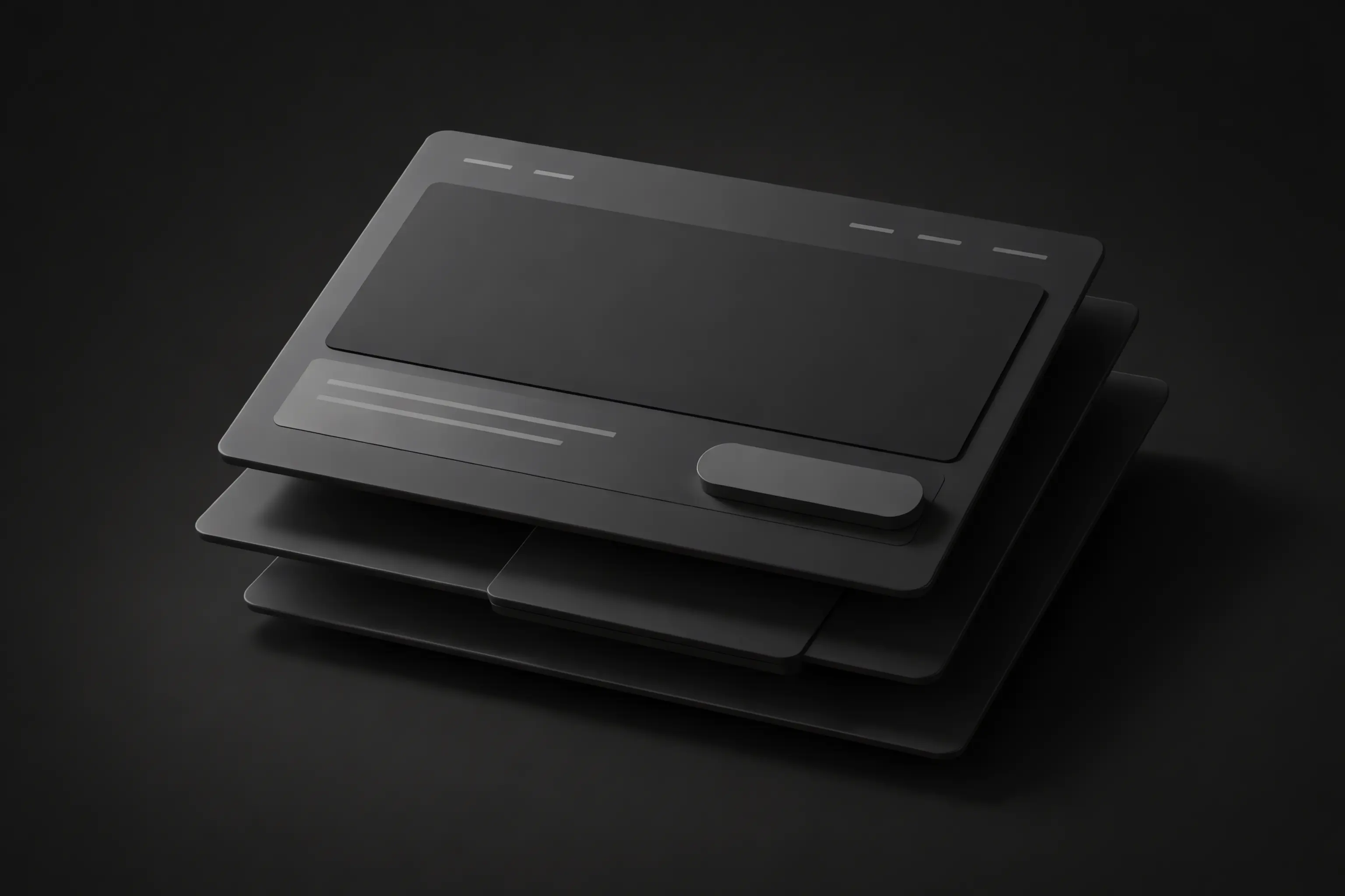
Structure It Right
A landing page, as the name suggests, consists of a single page. So, all the information you want to present to your audience has to fit on it. It shouldn’t overwhelm your visitors, and its flow needs to be smooth and easy to follow.
To prepare a conversion-ready landing page structure, follow these five web site design and development tips:
Have a strong hero section. Users spend 57% of their viewing time above the fold. So, your hero section has to get to the heart of the value proposition with a compelling headline and CTA.
Expand on the value proposition. Right under the fold, dedicate one or several sections to the product’s features and benefits.
Add trust signals. User-generated content, reviews, testimonials, awards, certifications, and client logos can all sway the visitor’s opinion in your favor.
Create a form (optional). Most landing pages capture leads via a form, but not all. If you need one, make it short, include clear field labels, and explain its purpose.
Add FAQs. Use this section to address any concerns and doubts your target audience may have.
Reduce UX Friction on All Devices
As a user onboarding service, we know just how detrimental even the slightest friction can be to conversion rates. To prevent it on your landing page:
Adopt a mobile-first approach during design and development (over 60% of internet traffic comes from mobile devices!)
Remove distracting visuals, unnecessary text, and extra links to declutter the page
Design the user journey to require as few steps or clicks as possible for completing the desired action
Ensure high load speed and performance to prevent high bounce rates
Stop Losing Potential Leads.
Turn visitors into customers with a high-converting landing page. We combine strategy, powerful UX, and sleek design to drive results.
5 Site Development Best Practices for Landing Pages
Landing pages that are primed for success:
Instantly capture the user’s attention
Make a compelling case for what you have to offer
Seamlessly guide them toward taking the target action
Building a landing page that checks all three items off that list is no easy feat. Here are the five site development best practices we follow at Fivecube to do it:
Conduct thorough audience research to inform the page’s structure, design, and copy
Make the CTA stand out with color and motion design
Use powerful visuals to command attention
Maintain a consistent visual hierarchy to maintain and guide users’ attention
Always conduct user interviews and A/B testing to confirm your assumptions
7 Mistakes to Avoid
Some clients come to us with a request to improve their websites because they don’t hit the desired KPIs. Based on our UI/UX audit and redesign experience, subpar conversions typically stem from:
Adding too many elements to the page, leading to cognitive overload
Overlooking mobile responsiveness during web site development
Lacking clarity in the value proposition
Focusing on encouraging multiple actions on a single landing page
Using generic, uninspired visuals
Making the forms too long
Not continuously optimizing the page after launch based on real-world analytics
A Word on the Technical Aspects of Site Development
The technologies you select for web site development will impact the landing page’s performance and mobile responsiveness. If you opt for using a website builder, you may also end up limited in your design choices.
So, give enough thought to what you’ll be building your landing page with. Consider:
Integration with your marketing website and other tools (CRM, etc.)
Analytics tools integration
Caching, CDN, and other performance-optimizing features
Desired element and page behavior (e.g., animations), especially if it’s custom
Ease of content management
Mobile responsiveness
Support for custom web site development (for website builders)
Potential vendor lock-in (for website builders)
Final Thoughts
Building a high-converting landing page can sometimes be more difficult than creating a successful marketing website. After all, you have to package your value proposition into a single, concise page that commands attention and persuades users. In web site development, achieving more with less is always more challenging.
Your landing page’s conversion rates aren’t as high as you expected? We can audit its UI/UX to understand what works and what doesn’t. Discover how we did exactly that for Deed, a property investment platform, from our case study.
Dec 29, 2025
By
Fivecube Team
Previous Article

Want a tailored solution?
Let’s build something great together!