Users' attention spans today are not what they used to be. In 2004, a typical user had an attention span of 2.5 minutes. Today the average stands at 47 seconds, a 3x decline within just two decades.
That is why it is in your best interest to present the most important information first on your website. Here is how we use visual hierarchy at Fivecube, a full-service graphic design agency, to capture and guide users' attention.
TL;DR
Visual hierarchy is how you organize elements on a page based on their importance, so users notice the right things in the right order.
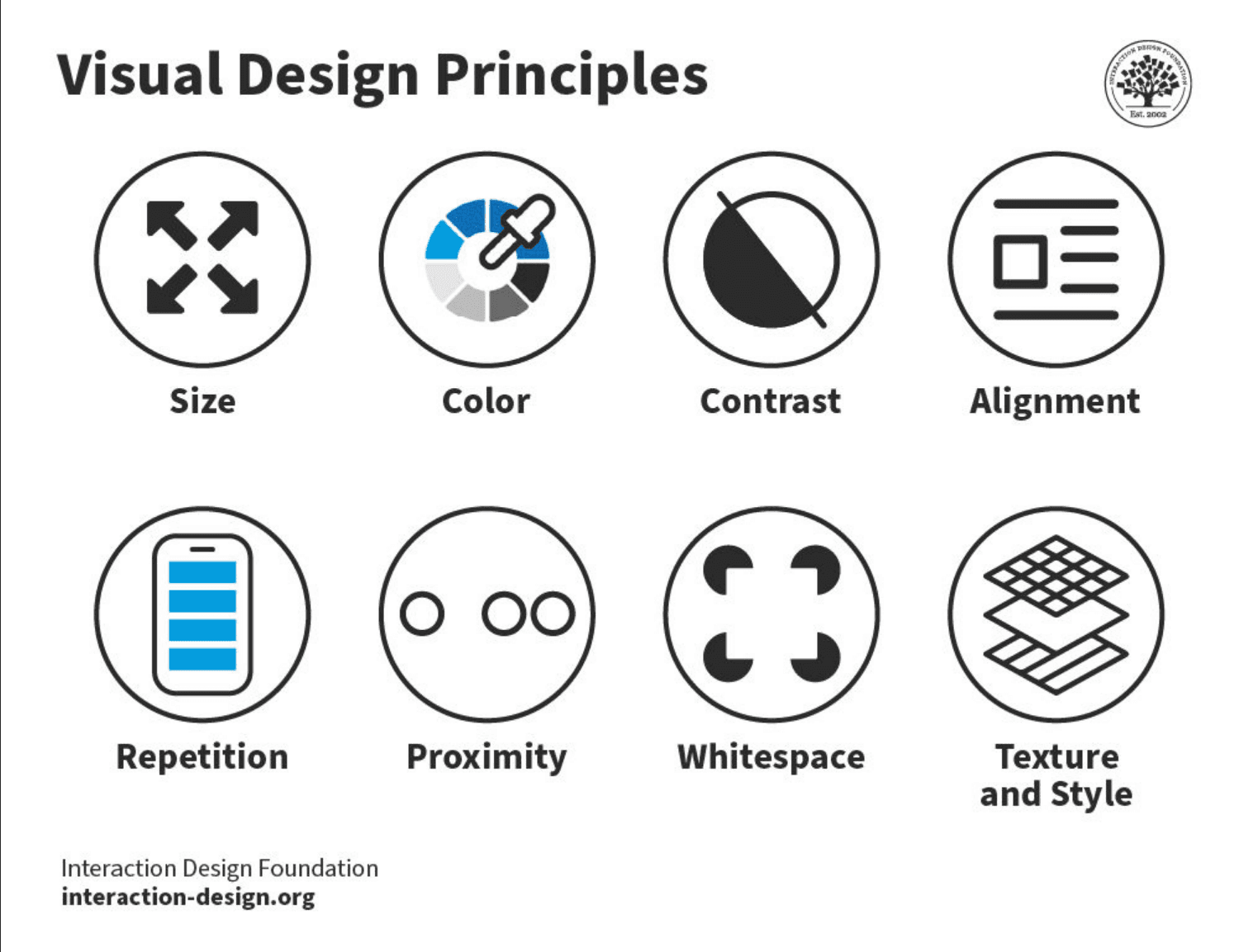
You can make elements stand out by manipulating size, color, contrast, alignment, repetition, proximity, whitespace, and texture.
The best practices include defining one primary focal point, choosing the right reading pattern, using three-level typography, applying the rule of thirds, using progressive disclosure, designing for responsive screens, and testing your layout.
Get it wrong and users get confused and bounce. Get it right and you improve scannability, engagement, and conversion.
What Is Visual Hierarchy?
Visual hierarchy is the deliberate arrangement of design elements by importance, so the eye is drawn to the most important content first and moves through the page in the order you intend. It draws on the principles of Gestalt psychology to organize information and page elements from the most to the least important, guiding attention toward focal points such as CTA buttons.
In short: visual hierarchy in web design decides what users see first, second, and third. When it is clear, the page feels effortless to scan. When it is missing, users get confused, frustrated, or overwhelmed, which shows up as high bounce rates and poor engagement and conversion.
8 Elements That Create Visual Hierarchy
What is visual hierarchy in graphic design if not emphasizing the more important elements? There are several ways to signal that importance. Here are the eight characteristics you can manipulate:
Size. Larger elements easily become a focal point.
Color. Bright accents and colors catch the eye.
Contrast. High contrast grabs attention more than low-contrast combinations.
Alignment. Breaking the established alignment automatically draws attention.
Repetition. Consistent styling communicates that content is related.
Proximity. Elements placed closely are perceived as a group of related items.
Whitespace. Blank space separates an element from the rest, making it stand out.
Texture. Rich textures attract more attention than flat ones.
A useful mental model here is the isolation effect: people remember and notice the item that differs most from those around it. That is why a single high-contrast button on a calm page outperforms five competing accents.
Why Visual Hierarchy Matters
Hierarchy is one of the core pillars of visual design, alongside space, contrast, and scale. Beyond looking polished, using visual hierarchy in web design does three practical jobs:
It grabs attention. A clear hierarchy directs the eye to the message or action that matters most.
It guides the user journey. Users can navigate content, absorb information, and take the next step, whether that is filling out a form or making a purchase.
It creates a scannable layout. Crucial items stand out, so visitors engage instead of bouncing.
The reverse is just as true. If a page has an unusually high bounce rate, a weak visual hierarchy is often the reason.
Build a Website That Guides Every Click.
Turn scattered attention into clear action. Fivecube applies proven visual hierarchy techniques so your key message and CTAs are impossible to miss.
How to Use Visual Hierarchy Effectively: 7 Best Practices
Visual Hierarchy Examples
As an on-demand design service provider, we apply the key principles of visual hierarchy in virtually every project that comes our way.
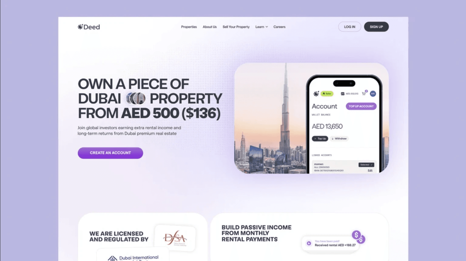
For example, we used visual hierarchy best practices to redesign a marketing website for Deed, a property investment platform. We highlighted the key value proposition in the hero section using a large, bold font and carefully laid out the design elements to build trust and drive conversions.

Or take Movein as another example. Before designing a website for this real estate platform, we conducted user research to identify the most important elements for the target audience. Based on our findings, we put the property search bar right at the top of the page, which helped drive engagement.
The same thinking applies to landing pages: a single dominant headline, one clear CTA, and supporting proof arranged in a Z or F pattern will almost always convert better than a page where every block competes for attention.
Common Visual Hierarchy Mistakes to Avoid
Too many focal points. When several elements shout for attention, none of them wins.
Weak contrast on the primary CTA. Your most important action should be the most visible thing on the page.
Ignoring whitespace. Crowded layouts flatten the hierarchy and increase cognitive load.
Desktop-only thinking. A hierarchy that only works on a wide screen breaks for most of your traffic.
Final Thoughts
Paying attention to visual hierarchy is essential if you want users to process the design correctly, navigate every page easily, and stay engaged. That, in turn, means higher conversions and UX satisfaction.
Not certain if your website follows visual hierarchy principles? Contact our design experts to discuss how we can audit and redesign it to resolve issues like high bounce rates and low conversions.
By
Fivecube Team
Frequently Asked Questions
What is visual hierarchy?
Visual hierarchy is the arrangement of design elements by importance, so users notice the most important content first and move through a page in the intended order.
What is visual hierarchy in web design?
In web design, visual hierarchy uses size, color, contrast, typography, spacing, and placement to guide the user's eye to key content and actions, such as a headline or a CTA button.
What are the main principles of visual hierarchy?
The core levers are size, color, contrast, alignment, repetition, proximity, whitespace, and texture, applied through practices like reading patterns, three-level typography, and the rule of thirds.
How do you use visual hierarchy effectively?
Start by defining one primary focal point per page, choose a reading pattern that fits the content, set a clear typographic scale, use whitespace and contrast to emphasize what matters, design for mobile, and test the result with real users.
Previous Article

Want a tailored solution?
Let’s build something great together!